


As Ferrari leaves its traditional elegance aside in favor of expeditions to the limits of geek-gauche, few efforts by the Modena firm are as dismaying as its Special Projects one-offs. Jimmy Glickenhaus’s million-dollar Enzo-upgrade, the Pininfarina P4/5 set the pattern: one-off Ferraris must clearly signal that their owners have far more money than taste. Following in that bold tradition is this, the P540 Superfast Aperta, based on the 599 GTB. Though it looks like the buyer, Edward Walson, simply asked for a gold, targa-topped 599 with 250 GTO styling cues, the Aperta was actually inspired by the gold Fezza from Fellini’s Toby Dammit. Not that the pedigree keeps the Aperta from looking like a 1970s oil-sheik special. And considering this dismal re-working does such disservice to Ferrari’s best-looking car (plus the targa-top adds 50 lbs), it’s hard to see why they were so certain the project was “in keeping with the brand’s ideals,” as Autocar puts it. On the plus side, Walson gets the 540’s tooling to ensure uniqueness. Here’s hoping it stays as “unique” as it is “special.”.


When I saw the photo, I was certain it was a Dodge Viper with a kit-car fascia. Jesus H God what a monstrosity.
Hell, I thought it was a Tesla/Lotus kit car. Yeeek.
Back in the 70’s there were all sorts of awful attempts at making Corvettes look something like a Ferrari. Now we have Ferrari’s being made to look like 70’s Vettes.
it’s hard to see why they were so certain the project was “in keeping with the brand’s ideals,” as Autocar puts it.
Giving people with more money than taste what they want at an exhorbitant profit. I fail to see how this could possibly be divergent from the brand’s ideals.
Fugly? Sure. You outta see some of the crap that Porsche does.
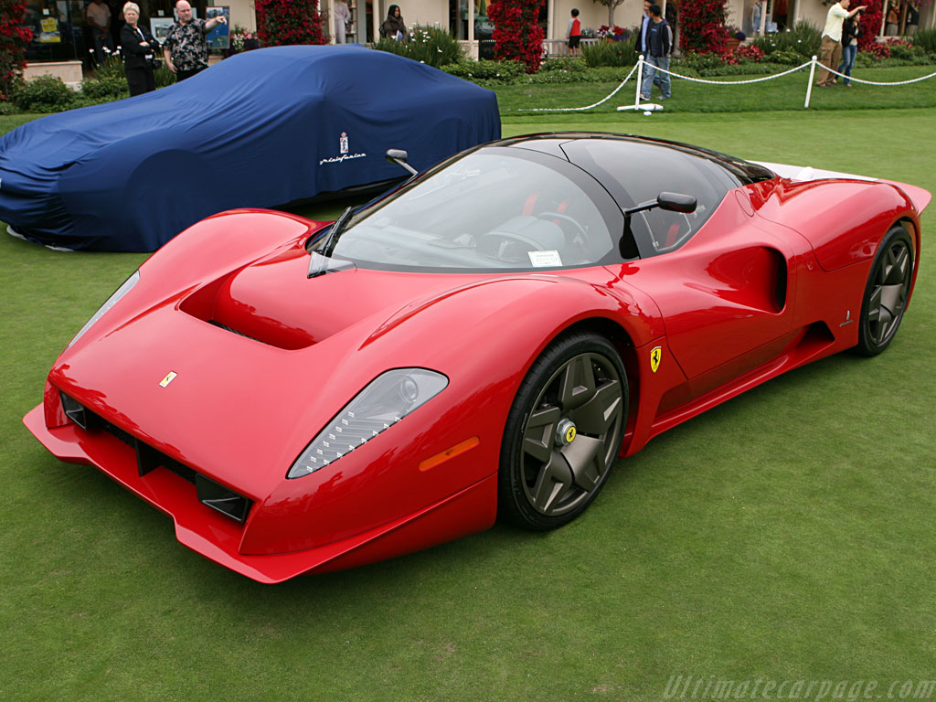
The styling cues are not so much 250 GTO as 275 GTB/4 to my eye.
Actually, though I’m not big on retro, but aside from the color I rather like it.
I look forward to seeing this on bringatrailer.com in twenty years.
It’s a CorLotarri. Why in crap brown?
It does look the most like a 68-73 Vette. Hate both of the two tone colors but then again some people have all their taste in their mouths and in this case more money than brains.
I, for one, thought the Glickenhaus P4/5 was a massive improvement over the execrable Enzo. Anybody with me on this?
I’m with you. The P4/5 is an epic rebody from start to finish, for a real enthusiast, while this gold contraption is just the result of a rich guy w/too much money & no taste. The Enzo & F50 were not at all attractive, though the Enzo has quite a presence.
+1 on the P4/P5. Love it. It has curves.
The gold thing in the picture? Nope. Don’t like gold and don’t like the shape, the details, the wheels, don’t like anything I can see in the picture. Even the grass in the background is kinda scraggy.
The Enzo is not execrable, imo. It’s not 308GTS-pretty, certainly, but it’s clearly a case of aerodynamics –as well as literally linking the road cars to the Scuderia’s– overruling anything Pininfarina might have suggested.
Absolutely. That was the car Ferrari should have made.
C’mon, guys, it ain’t THAT bad…
Oh yes, it is. Good design is coherent. The Italians are master at that, especially the fluidity and clarity of line. What makes the 250 GTO so beautiful is that it seems to be carved out of solid muscle. It “fits”, and it flexes doing so. This car has no coherence anywhere, it seems to be designed by not two but three different persons not working together. There’s a front, a middle, and an end, and nothing fits together. Contemporary Ferrari front end, Chevrolet Corvette middle section, and the rear end from a Ferrari 275 GTB/4. The design doesn’t make sense, it doesn’t hold up together, it’s not a coherent “whole”. It looks like what a two-person Californian coachbuilder would make out of a Corvette and some glassfibre-mouldings.
Front: Callaway Corvette
Back: 67 and later Corvette
It is strange that working for the same corporation as Maserati and Alfa Romeo (who make some of the most beautiful berlinettas) Ferrari produces some of the ugliest designs.
Is it because the horsepower wars have reached a zenith (at some 600+) so to compete you must do so on avant style alone?
I like it, from this angle anyway. Red would look best though