


I had the distinct non-privilege of sampling an ND Miata at a Mazda event for the general public, which was also covered by one of TTAC’s sister publications. A gaze at the hood bulges at (slow) auto journo track speeds netted a surprise: there was an urgency to get this cab-backward profile on the Vellum.
It’s no different than being a design student; visions quickly sketched on vellum (lower case) were crucial. Today’s urgency isn’t for my GPA, but for Vellum Venom’s readers (all 51 of you) and for my soul. It’s been too long.

The proliferation of animated big-mouth facias, a design necessity as heinous (yet eye-catching) as 5-mph bumpers in the late ’70s, actually works here. The fenders have purposeful haunches, the squinty headlights are mad aggressive. Is this a modern take on the Austin Healey Bugeye Sprite?
The biggest buzzkill is the counterintuitive bumper-to-hood cutline, followed by the mandatory inclusion of a bucktooth front license plate in The Lone Star State.

It’s all good, aside from the oversized emblem (because MARKETING NEEDS UR ATTENTION) and that pulled back, balding forehead-esque hood cutline.
That damn hood/bumper: every other line conveys a sense of speed with vanishing points ahead of the vehicle. This cutline (i.e. the two lines starting at the headlights) sucks back to a vanishing point in the middle of the hood, visually slowing down the fascia’s center, hence the bald forehead reference.

But I do not spew hate upon the designers. I reckon the bald head is the byproduct of pedestrian crash regulations or insurance repair concerns.
Note the strong forward push of the headlights, going to a very happy vanishing point. Note how the hood/bumper cutline, like a dog locking all four legs in protest, fights the speedy momentum to a bad, bad vanishing point.

The trim panel covering the tow hook is part of the Miata’s smiling charm: a typical square plug slows things down even further with that awful hood cutline. Then again, a square one gives the Miata a Cindy Crawford-esque mole above the lip. Hmm!

The fog light’s recess accentuates the bumper’s lower taper and blade corners. The flattened plane encompassing the grille gives the look of taught, elegant lips around that smile.

The requisite Lamborghini blade-tipped lower splitter (hopefully) adds downforce, but it’s an exploited bit of angular froufrou, a design cliché.

I didn’t sneak in a shot of a BMW E90. I promise.

But the reflective details surrounding the headlight’s chrome canister are more first-person shooter video game than Germanic understatement. The old school, exposed, amber bulb kills the high-tech vibe.

The eyebrow extension from the headlight arc down to the bumper’s midsection is fantastic, except when it reminds us where the hood should exist in a world without design constraints.

This sheetmetal transition is the origin of the ND’s strong haunches. Like a C3 Corvette, this is why you see the fender tops from behind the wheel. And it’s awesome.

Converting a 3D shape to a 2D photo is tough, but the fender haunch is real!

Note how fender buldge sucks inward as it reaches the door. Just absolutely luscious!

Oh, that dash-to-axle ratio. Still, the voluptuous fender deserves to shed the harsh plateau at the closest point to the wheel. Perhaps this transition is an aero-enhancement?

That lengthy dash to axle ratio is marred by the unnecessarily triangular signal (marker?) light and its forward-thrusting negative area. At least it’s not a plasti-chrome fender vent.

Black and charcoal wheels have a purpose on a sports car, but the static nature of spoke-y wheels following the boxy lines of a four-lug hub look too static in relation to those fenders. Classic wheel elements are needed: a flatter hub with shorter spokes emanating from said hub to compensate — and don’t let the lug nuts dictate the shape of those four split-spokes.
Or it’s no biggie considering classic four-spoke MG wheels. Whatever.

The rocker extensions fit the bill and their black paint visually thins the mid-section. My thumb shows the amount of depth added here.

Note the multiple planes/folds: they remain low, ensuring adequate surface tension without detracting from the Miata’s otherwise clean sheetmetal appearance (*cough*new Lexus RX350*cough*).

There must be engineering need for the cowl’s lumps and bumps: ironically, the hood hinge’s trapezoid shape apes the front bumper/hood’s hideous cutline.

The center section is thankfully and classically subtle.

Remember all those hard edges at the bottom? Hard to find now!
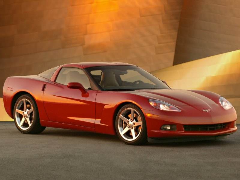
The rest of the side matches the fender’s curvaceousness with a blend of soft and hard edges. Remove the hard bits and you get the “soft” look of older Miatas. Add more hardness and you get something C7 Corvette-like. This is truly the best porridge out of the three.

Goldilocks approves of the quarter panel’s blend of hard and soft sheetmetal textures. This is a subtle bend adding toned muscle where most vehicles look flabby.

A better angle of that toned muscle.

Too bad about the cheap end caps on the belt line’s trim.

Same problem on the door’s leading edge. I hope saving those nickels was worth it.

Maybe, yes! I mean, no DLO FAIL! And no plastic triangle between the door and the A-pillar! The fixed glass window is a welcome bit of Aston Martin when a cheap C6 Vette A-pillar would have been acceptable.

There’s a somewhat pointy leading edge to the side mirrors which, like the rest of the body, provides pleasant surface tension.

Cant say the same for the bubbly glass outline with the chubby door cutline. Much too and too much “round.”

Could the glass ape the fabric top’s angular stitch line and still roll down into the body at the flick of a switch?

The A-pillar has a subtle flat spot, presumably for wind-noise cancellation?

Too bad about the multiple panels making the windshield hoop.

Ditto the panels above the folding top.

All the quibbles disappear into a stunning cab-backward roadster with trim overhangs and a cohesive front-to-back, wave-like flow.
The varying grades of shadowing (mild near the door handles, darker as you reach the rockers) means the Miata is anything but a bland slab of sheetmetal.

Violently thrusting quarter panel to bumper cutlines are frustratingly par for the course today. Integrating the taillight’s genesis didn’t help much.

The harshness mellows from a lower perspective, but the flat wheel well edges don’t help on this axle either.

The brake light’s corresponding negative area deserves to be this machine’s design hallmark. The bumper sports a hard crease high up, becoming evident from a full rear shot.

A very pleasant recess within the signal lights gives the ND’s posterior even more depth.

Non-Miata racers, get ready for that negative area to piss you off on a track day. Does the trunk’s painted bumper panel gaps makes theirs a pyrrhic victory?

The “lights must impersonate rockets or guns” shtick is wearing thin, son.

Like buying a computer with “helpful” free software, the satellite radio dorsal fin is a horrid addition. No designer works appease Sirius/XM radio.

Too bad this CHMSL isn’t an LED strip on the trunk face. Pleasant hat-tip to the NA Miata, wasted.

Ditch the gigantic brand badge (MARKETING NEEDS UR ATTENTION!) that rubs close to the cutline and spoiler and put the CHMSL there.
The contrasting spoiler looks like a tacked-on afterthought, and my goodness that’s a big ol’ bumper!

The backup lights ape the front fog lights, adding continuity.

Far too many cars overpromise with ridiculous exhaust tips. The ND Miata has bare (but stainless steel?) pipes. Save weight everywhere you can, man.

Even with all the tacky add-ons, the dichotomy between the short, upright trunk and the big, curvy bumper is appealing.

Don’t get me wrong, that motor’s naturally aspirated mid-range torque deserves recognition, but the Miata’s butt is dying for more clean space.

This round tow hook plug is in stark contrast to the front’s rhombus thingie.

Oh look, another antenna! This one is better, right down to its functional spiral twist.

The flares add muscle to this stereotypical “chick” car. Even the taillights accentuate the look: no more tumblehome to the roof is needed to look strong and sporty, especially considering the tight interior dimensions.

If not for the extraneous crap on its posterior (and that hood cutline), this could be one of the most beautiful, functional, purposeful sports cars of its generation. Where else can you get a brilliantly proportioned roadster complete with fenders visible from behind the wheel?
Oh, and it’s damn fine on a road course, too.
Thank you for reading, I hope you have a wonderful week.


Something about the rearview on this one looks “wrong”. I think it would look better with more black trim further up on the bottom of the back bumper. Maybe at the cutline just below the circle cutout for the towhook? As is it looks like it has too big of a butt for a small car.
I think I’m trackin’ with you on this: if the deck lid sunk deeper down and the bumper occupied less space, the hard bend of the rear bumper wouldn’t be so dominant.
It’d have a more conventional and “less wrong” look. Also, less dead space in the middle (between the trunk and the license plate.)
Yes, I think you are right. Lots of cars have a black rear valance down there to make the bumper look slimmer than it is… sometimes they use “aero” effects but that isn’t really necessary. Something like the black valance on the Mustang GT for instance.
Agreed. The rear looks somewhat like a noseless blobfish. Extending the negative space between the two tail lights and dropping the trunklid down to meet it would fix things, plus give the appearance of additional clean space at the rear.
The extra panels behind the top hide mounting points for a removable hard top. The aftermarket is about to offer the first.
To add insult to injury over the damn emblems, *all* of them are pinned into the bodywork, eliminating the possibility of what would be an obligatory, 5 minute, dental floss debadge.
Same goes for the damn shark fin, unless one opts for the base car. Drilled.
Gah, what? Who does that with emblems these days? That Skyactiv badge would’ve been the first to go. Not even my Cadillac has pinned emblems!
So apparently we still haven’t hit Peak Emblem. And Mazda’s not even in the first tier of offenders (GMC, Lexus, and Mercedes).
Mercedes must win the pioneer award for large emblems, as the G-Wagon SUV has always had a huge one even back in the ’70s.
Audi followed up in the ’80s for passenger cars with giant rings on the Quattro GT.
To which Mercedes responded with the 560SEC. And it’s all uphill from there.
Edit: Though the VW Van may have them all beat in timeline. And I know there were some old Citroens where the emblem was the entire grille.
I am pretty sure we’ve hit Peak Emblem:
https://www.thetruthaboutcars.com/2015/02/vellum-venom-vignette-peak-emblem/
I am 1 of 51. Solid phone case, Holmes.
I am 2 of 51; always enjoy these; thanks Saajev. Was thinking the other day it has been awhile since we’ve had one of these.
I’ll take the 3rd spot. Vellum Venom is one of the reasons I come to TTAC. I wish Sajeev would post a couple of them a week.
Added bonus is the “B&B” never devolve into personal attacks in the comments.
4th. Vellum Venom is one of my favorite features here. I, too, wish there was at least one per week. Two would be even better.
I learn something new in each one – something that I can’t say about very many articles here.
I gotta say, all this Kudos is touching. The next one will really blow your minds.
I just realized what the tail lamps remind me of. Those whirlygigs that fall out of maple trees!
The amber bulb needs to go from the front headlamps STAT. To be replaced by a simple, dual LED amber strips above and below.
Or instead of a strip they could do it as a round circle, as a callback to the NB and NC Miatas that had round circular amber parking lights inside the front headlights… although they would need to move it to the inside edge instead of the outside edge for it to evoke that.
Maybe the Targa version will have an in-glass antenna, to get rid of that 1999 throwback on the rear fender. Such an appendage on such a simple car (especially in black, and not retractable) looks very poor.
My thoughts exactly. Why the need for two antennas? Every car I’ve had since 2009 has had the one “shark fin” antenna. The shark fin isn’t the prettiest, but at least it’s not some stark black appendage that looks straight out of the 90s.
Normally as others have mentioned, the antenna for the radio is in the back glass, which isn’t possible on this soft top. The Targa should fix this. But that doesn’t excuse the black, non-retracting radio antenna usage here to save some money.
I think the Mazda m.o. has been to fit a retractable antenna on the top trim and a fixed antenna on the mid-range and base trims. The retractable antenna may have been optional for the lower two trims, but I can’t confirm.
There are aftermarket power antenna kits available for anyone that can’t live without it. I can’t imagine this detail being a deal breaker for anyone seriously considering this car, but people will always surprise you with their craven idiocy.
Nope, black antenna present even on top of line Grand Touring on Mazda build site.
Oh, somewhere in this favored land the sun is shining bright, the band is playing somewhere, and somewhere hearts are light, and somewhere men are laughing, and somewhere children shout; but there is no joy at Jake Sweeney Mazda West for mighty CoreyDL has spoken out. :(
The Tri-County branch is much much closer to me, lol. Can’t be driving 45 minutes down into the west side to look at Mazdas.
In all designs, you can go crazy picking nits, but you just have to take in the overall look. True, some design “flaws” begin to hit you after a few minutes, but it appears many of the so-called flaws have to do with manufacturing or costs or both.
One can design a form, but when it comes down to actually building it, things must change for better or worse.
I wish the fixed triangular window pivoted open. Now THAT is a flaw!
As far as over-sized emblems go, that is a fact that has infected the auto industry for at least the last 10 years or so. Some of those emblems can be seen from the air!
Yes, that feature (flap windows) is sorely missed. There must be some reason they’ve been banished….like extinct….nowhere.
I think it looks great in that putty color, too. More interesting than white, less prevalent than gray.
I haven’t actually read the article yet. I am just going to make a pre-read prediction. It’s not going to be pretty. It is a $25k+ mass produced vehicle after all. It looks good at 50 feet, it even looks good at 10 feet, but I am not so confident at 6 inches. I won’t be shocked if they fudge a few details here and there for the sake of manufacturing efficiency since few will actually look at it in this detail.
Now to read the article and see how wrong I am.
And I read it. Pleasantly surprised. Only a few “I hope they enjoy the nickles that they saved” moments.
These V-V deep styling dives are fascinating but so much training, expertise and attention expended on a derpy little sports car is irksome.
I’d like to see such scrutiny directed at something actually popular… CR-Vs, RAV4s, Escapes, Rogues…. that kinda thing.
Except no one cares about sexy lines on a CR-V, RAV4, Escape, or Rogue. Anymore than anyone cares about sexy lines on their Kenmore refrigerator.
Christ, not sexy… soothing, harmonious, reassuring, ovoid… anything but sexy. For sexy, I ogle women.
I’m sorry, but something like the Jag E-Type or a DB5 is dead sexy!
Well, they would offer safe sex, anyway, I guess. So long as nothing was still burny hot from driving it.
Be careful, as Lucas is known for infidelity and could give you something.
“Be careful, as Lucas is known for infidelity and could give you something.”
Sin peligro, them little scrawny types ain’t never been my thang, anyway.
” Anymore than anyone cares about sexy lines on their Kenmore refrigerator.”
Cold. :-)
Read the archives for gems like this: https://www.thetruthaboutcars.com/2012/11/vellum-venom-2012-dodge-avenger/
OK, but that’s a low rent poo-car. Howzabout Honda or Toyota? And not little crampy Hondas or Toyotas :-D
The new Camry is on my list. Believe that.
Definitely looking forward to it. That’s a worthy car.
Yes. Worthy of derision.
huh huh… YAH… huh huh
i laughed my ass off when i seen nat
Interesting observations as always. The antenna looks redundant next to the shark fin. Don’t other manufacturers incorporate all the functions into their fins, or is the AM/FM reception built into the glass?
Built into the glass usually. If you look carefully at the rear defroster grid, you may notice the grid at the very top is not connected to the grid at the bottom. The top grid is the AM/FM antenna and the bottom grid is the actual defroster. That’s how it was on my RSX-S anyways.
Now do one for the Fiat 124! (Before it breaks down)
My thoughts on the new Miata:
1. Pictures somehow don’t do it justice. It looks a lot better in person. Whenever I stop by my local Mazda dealer I’m still always impressed with just how GOOD this car looks. It has a commanding road presence to back up its pedigree. If I had $35K to blow I’d have an RF version as my second car.
2. Sajeev and I will disagree on this point but I am not a fan of the narrow, squinty headlights. Why’s the Miata got to be so angry? This contributes to the “giant brow” problem, by the way, because the hood height is just so tall that there’s nothing to break this up. It looks better in person, admittedly—but I hate how the lights photograph. This is as close as we’ll get to a G-6155 Interceptor in real-life form, but the lights need more height. The Fiat version looks much better in this regard.
3. The hood cut. As people who have read my comments in various articles before, I am not a fan of most hood cuts. They’re not anything new, but we’ve had a rash of particularly lazy or bad ones in the past few years (BMW being a prime violator). The Miata’s cut looks like someone was aware of the necessity of a hood cut, but couldn’t figure out a way to make it flow with the requirements of both the grille and the badge, and intentionally designed it to be this way. It’s trying its best to work into the flow of the hood, and on some angles it’s OK, but others it just falls flat. If the front end didn’t look so visually “tall,” this would probably be less of a problem and there would be more ways to work the cut.
It doesn’t reek of afterthought like BMW’s. It doesn’t offend me as much in person as it does in pictures, and the pearl white paint is certainly the worst of the bunch. Again, this is a problem imposed by the squinty headlights and the flow of the front fender haunches across the hood. Making it look better is probably a tall order without reshaping the headlights or breaking some kind of platform limitation with the front fascia. The Fiat version solves this problem by not even having a hood cut but rather shaping the hood area differently to afford an inset hood. However, it gives up the very cool fender styling of the Miata to do so.
I wish makers would offer an ‘antenna delete’ package. I’ve never used satellite radio, yet every vehicle I’ve bought in the last 10 years has had the unsightly shark fin just in case I get a sudden urge to spend money to listen to Howard Stern.
Sat nav is in there too, Monsieur.
I don’t listen to satellite radio, because I have a phone that has my content on it. I don’t use built-in sat-nav because I have a phone that has much better navigation than any car I’ve owned.
But fair point, I imagine a lot more people use built-in navigation than satellite radio.
So happy to geek out reading an other VV, thanks Sajeev!
Something about the front end always bothered me but I wasn’t sure what. I like the front a lot, way more than the back. I was aware of the fangs on the hood, but I didn’t think that was it. Now, after reading this, that’s all I’ll be able to think about.
As I mentioned in something a while ago, Mazda doesn’t paint the center section of the windshield surround on either these or the 124. Seeing that really bothered me. It seemed needlessly cheap with potentially severe future consequences.
Also, can we be done with the black A pillars soon? I don’t like them on the GTR and I don’t like them on anything else either.
The front view looks like a toothless sand shark. It has a cartoonish goofy look to it. I am not a sports car guy though so I probably am not being marketed to with this.
Dynamically dynamic yet totally devoid of excessive dynamicalism.
Sigh. I like it.
Sajeev, you haven’t done a Vellum Venom on any of the previous generations of Miata, have you? (Google search says “no”) I would be interested to read those, especially the NA.
If you’re too busy, you can always ask “Sanjeev” to do it.
Sanjeev is an idiot. If only I could trust him to do my work.
There is a slight possibility that the next president will deport Sanjeev to Mexico.
nifty take.
the rear works better in black http://photos.spriggs.net/archives/001626.html
the front, too http://photos.spriggs.net/archives/001623.html
I always wondered about the “chick” car reputation of Miatas as the vast majority of the ones I’ve seen are driven by guys. A quick bit of web research shows Miata sales skew heavily male (roughly 2/3rds male buyers), while most vehicles are much closer to 50/50.
Knuckle dragging muscle car guys are the source of that.
Honestly every time TTAC does an article about the Miata, I want one more badly.
If the Miata were exactly the same except British and unreliable, it wouldn’t have this reputation. Because then it would be desirable and manly to the aforementioned subset.
Meh. Ugly little car. Much prefer NC.
That said, excellently composed article. Definitely need more of these.
Sajeev, can you expound on the flat-wheel-arches design choice? Those seemed to show up and quickly become ubiquitous. Are they always the right choice?
And awesome VV, as always. I want a white mono-specchio Testarossa with your VV article laid out in poster form. Can Sanjeev do graphic design?
Sanjeev is a talentless hack. But speaking of, since I have no industry insight into aerodynamics, I am only guessing that flat wheel arches help smoothly direct air over the wheels?
The subtle “muscle” bend in the quarter panel gets a lot of negative reviews in design circles. I think the writer nailed it by saying that if you remove it the result would be a flabby rear.
Flab is worse than fake muscle.
I basically own this car – a white 2016 Mazda MX-5 Miata.
…but with one difference: I don’t have the stupid satellite radio shark fin!
How did I accomplish that? By buying the base Sport trim. No satellite radio, no shark fin.
no shark fin and no limited slip differential.
but i’m there: if i could get the car (or any car) with no radios at all.
I have a 1990 Miata that I’ve driven for the past 25 years or so. It is built like your average early 90’s econobox, tinny, noisy and vibration-y, but it’s got heart and still gets me around on long and short trips. From my admittedly biased point of view, the shape has aged well.
Mazda improved that silhouette in the second iteration (the best of all four from an appearance POV), sorta lost the plot on the third model and has gone overboard without a lifejacket on this latest offering.
From Sajeev’s POV, the individual components are pretty cool, but my opinion is that they add up to the automotive equivalent of a poser.
The exterior design is writing cheques that the rest of the car can’t cash. The Miata isn’t a Vette or Camaro or Mustang. Mazda shoulda stuck with something less aggressive looking which would age gracefully, not make the owner look like a wannabe Cars and Coffee attendee.
I recently purchased the basic “sport” model of this car, in the same ceramic color pictured, and it alleviates many concerns WRT front lip, antennas, spoilers, and especially those awful huge black spoked wheels. We also get a radio with real buttons, no nav that will be dated in 3 years, and an extra console cubby instead of a knob. Even the base model has LED headlights and leather steering wheel and shifter.
Wish I had a body-colored CHMSL instead of black, but I am pretty sure I can fix that myself.
My only option was the $130 smart key. Every car on the lot had it. Loved it on my prius and I love it here. Mazda and others will sell you the LSD for $1100 separately if you really need one.
Only plans for this car are dark bronze powdercoat for stock 16″ wheels and having a body shop remove the badges and fill in the leftover holes. Then add a small retro-style logo to the front, perhaps eunos-ish, there are plenty of aftermarket options. Badge pins are common to all Mazdas, I’ve had several.
>”The “lights must impersonate rockets or guns” shtick is wearing thin, son.”
NEVER!
I’ll also add that with a car this small and invisible, side repeaters help. Having the CHMSL as high and forward as possible helps. I’ve stuck hot purple LED bulbs in the DRLs, helps a LOT. As a person who drives this car every day I am grateful Mazda made these decisions.
getting my roadster serviced, i had time to wander the dealership and took a close look at the mx-5-rf. it looks a lot better than in the photos but it also had some really disappointing details. sajeev, you need to do a further vellum venom on this particular variant of the car.
I wish you’d commented on the high rear bumper with the license plate moved down below it, a departure from earlier MX-5s and most other cars. Could that have been a utilitarian move to match bumper height with other cars that aren’t so low to the ground?